RED Sambusas
2026
Redesigning RED Sambusas's Website
Turning a first-time client brief into an order-ready website in 10 weeks.
Overview
What is RED Sambusas & Catering?
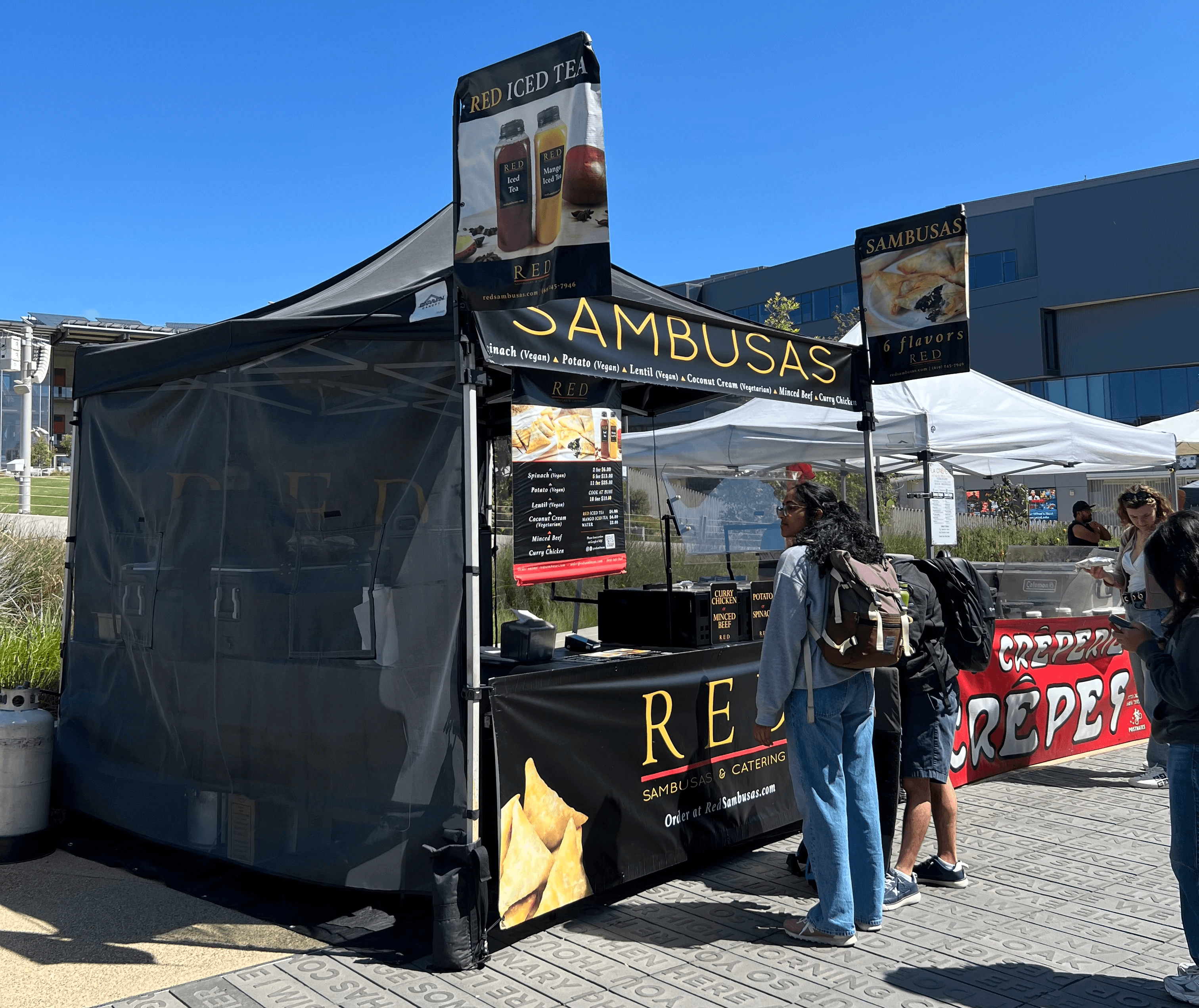
RED Sambusas & Catering is a family-owned business that has served the UCSD and San Diego community for nearly 20 years. Working with owner Mohamed Ali, I collaborated with a two-person team to redesign the website, focusing on removing the friction between a customer's interest and their completed order.
Problem
Unclear navigation of site and ambiguous ordering paths led customers to place incorrect or unintended orders.
Despite nearly 20 years of loyal, in-person customers, RED Sambusas' website worked against its own goal of driving orders.
Two separate, similarly-named forms — a general contact form and a catering form — regularly confused customers, creating duplicate work for both the owner and the person trying to place an order.
The visual design didn't reflect the brand's identity — the polish and warmth customers associate with RED in person wasn't carried through to the site, undermining trust for anyone encountering the business online first.
Menu information was unclear — items lacked consistent pricing, ingredient details, and dietary labeling, leaving customers uncertain what they were ordering or whether it fit their needs.
Research
What did I learn from users?
To have a better understanding about where users experienced issues when navigating through the site, I conducted multiple user tests, giving them a scenario and objectively watching how they execute the task. In addition to this, we also gained datapoints through user surveys.

Painpoints derived from surveys.
Ideation
Exploring interface directions
My team and I explored various ways to layout crucial information for RED Sambusas. We ultimately relied on our user testing to help understand the best placement.

Site lo-fis by my team and I.
User Testing Scenarios Influencing Our Design
Test scenario 1: First-time visitor, time-constrained (1 hour), tasked with finding the menu, identifying vegetarian options, and calculating cost
What worked: Menu was easy to locate from the landing page; navigation path (landing page → menu overview → full menu) was intuitive; user successfully adjusted quantities and calculated total cost
Usability gap identified: Vegan/vegetarian status wasn't visible on the menu overview — only appeared after clicking into an individual item, requiring extra steps to assess dietary fit
Secondary gap: No flavor descriptions for sambusas, leaving users without enough info to choose confidently
Overall satisfaction: 4.2/5
Design recommendation: Add clear dietary icons/signifiers directly on the menu list view so users can identify vegan/vegetarian items at a glance, reducing clicks and supporting faster decision-making
Test Scenario 2: Catering for a group, student org member researching catering for ~40 people, needing to determine cost and how to place an order
What worked: "Catering" tab was easy to locate in the top navigation; contact/inquiry form was conveniently placed next to the food options (Sambusas, Entrees, Drinks), making it simple to submit a request
Usability gap identified: No visibility into order quantity limits or per-item/bulk pricing on the catering page, making it hard to estimate cost or plan for group size before reaching out
Overall satisfaction: 4/5
Design recommendation: Add clear quantity and pricing information directly on the catering page (e.g., per-item cost, minimum/maximum order sizes, or bulk pricing tiers) so users can estimate costs and plan orders without needing to send an inquiry first
Designs


